How to create cool toned imagery with blue and grey backgrounds
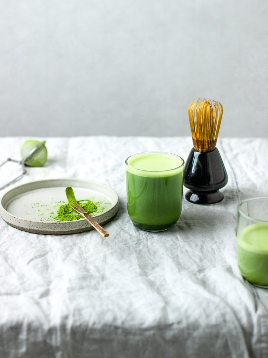
Using a variation of blue or grey in a food photography background will create beautiful cool tones in your image, and can be used in a huge variety of ways to create a different feel with each composition.
In this blog post I’ll be sharing lots of examples from my own work, both from personal projects and client commissions, to demonstrate just how versatile this choice of colour palette can be.
Let’s start with a few reasons to love a cool toned background
First up, they’re incredibly easy to find. There’s an abundance of linens, surfaces, backgrounds and serveware in pale blues and varying shades of grey, so you’ll never be stuck for inspiration. A lot of kitchen tiles and marble slabs tend to be cooler toned too, so you’re more likely to find them on location (or in your own kitchen)!
Cool tones also allow for a lot of freedom when building a prop collection, as you can have a small selection of pieces you can use again and again in various shoots. Providing a pretty neutral base, soft greys are far easier to incorporate into multiple colour palettes than, say, bright pink, or a deep foresty green.
As a general rule, soft blues and greys will work to keep the overall composition light and bright, as well as allowing the colours of the food to really stand out, although of course darker shades can be used to create moodier compositions too.
Blue and green
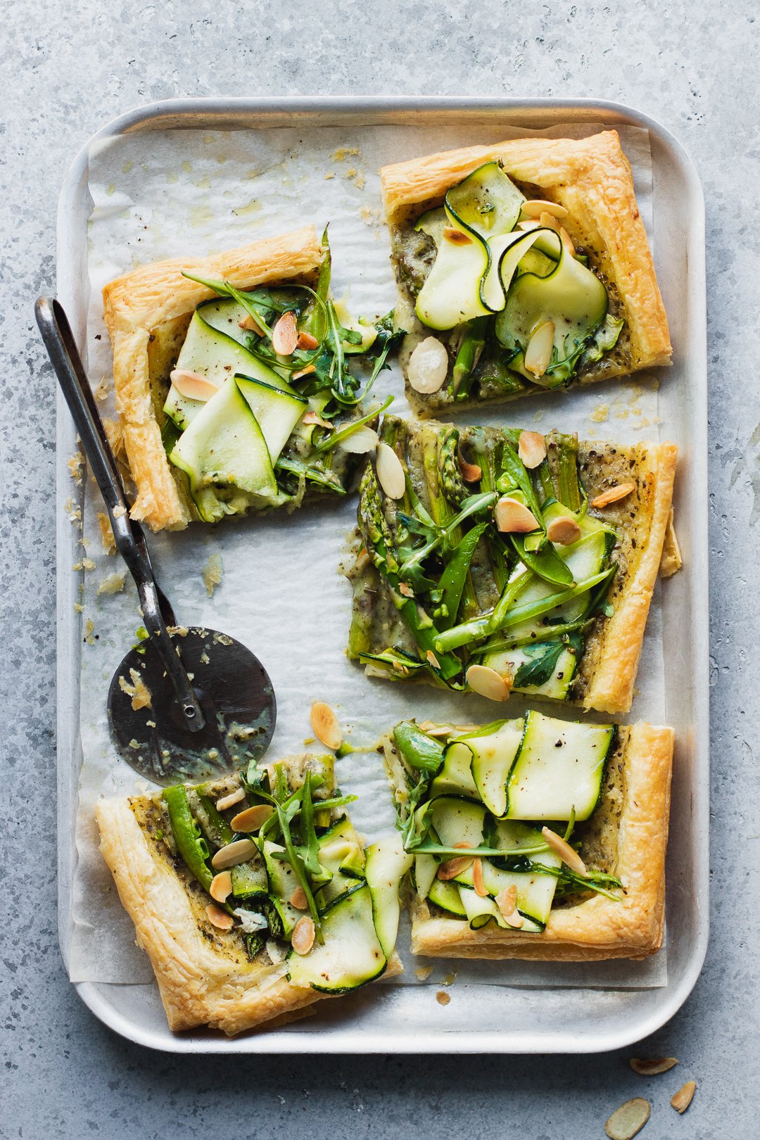
Blue and green is known as an analogous colour palette, meaning the colours sit next to one another on the colour wheel. This makes the overall image, regardless of the shades of those blues and greens, feel harmonious and calm, whilst also working to hook someone’s attention. Keeping the colours light will create beautiful spring-like imagery, particularly if paired with natural light, as seen in the spring greens tart image below.
Blue and orange
Blue and orange sit opposite one another on the colour wheel and create what’s known as a complementary colour palette. This will make the overall composition higher contrast, with the two colours a direct opposition to one another. It’s a very engaging colour palette and a great one to use when working with the golden hues of cakes, bakes and chocolate (and yes, brown is considered a shade of orange).
Blue and anything!
As I said at the top, blue and grey hued backgrounds work to create a beautiful base layer for almost any food. While greens and oranges arguably look best, greys are neutral enough to provide a background for most foods, perhaps with multiple colours like the Easter egg example, or to complement slightly darker hues, like the doughnuts and focaccia examples. It’s a great option to choose if you want the food to do the talking and create images for your brand that are aesthetically pleasing, particularly as the overall set up will feel relatable and accessible in comparison to bolder and higher contrast colour palettes. All 3 of these images use the same background surface, but create a different feel with each composition.
Are you looking for a food photographer?
Book a call with me below so we can chat through what you need and how I can help.
Like this post? Pin it to Pinterest and save for later.


